TYPES OF PRINTS
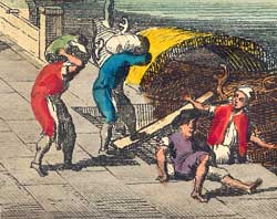
Prints from the Georgian era are found in a number of different types. In this section, we give a brief review of each type of print, with an enlargement of a small area of a typical print to show the nature of the surface. We will have to get a bit technical now, but we have tried to keep these descriptions quite short, so they are not very comprehensive.

Methods of making prints from this period are generally grouped under three classes – Relief Prints, Intaglio processes and Lithography. Each category has various subclasses. In practice, most of the prints we sell are engravings, etchings, aquatints, mezzotints and from later in the period lithographs.
Many prints mix the techniques and there are all sorts of specialist variations which you can only really appreciate by close study - we’ve added a few references to useful books. (But remember you don’t need to know all this stuff to enjoy a print!)
A really good book on all the different processes of producing prints is Bamber Gascoigne’s How to Identify Prints, Thames & Hudson, 1986. This is a comprehensive book covering numerous processes, including photographic and modern techniques. It has good sections on how to identify prints. We are really pleased to note that a second edition of this book has just been published in 2004 by Thames & Hudson, at a very reasonable UK£17-95 paperback.
Another good general source is Antony Griffiths’s Prints and Printmaking – an introduction to the history and techniques, British Museum Press, 2nd Edition, 1996. Antony Griffiths is Keeper of the Department of Prints and Drawings at the British Museum. This book concentrates more on the historical processes. Believed still in print.

COLOUR The majority of prints from the period were originally issued in black and white only. This is not surprising if you remember that many prints were the ‘photography of the age’. Their purpose was to present information, so colour was not really needed - and of course it was more expensive.
Some categories of prints were printed in colour or were routinely coloured at the time. In the first category, examples are stipple engravings and some mezzotints. In the second, vue d’optiques were available in coloured versions. We would say that these have original colour, or possibly more correctly contemporary colour. 
Where prints were printed in colour, identifying this is not too difficult, but where colour was applied by hand, there will always be some element of interpretation. A print might well have been hand coloured originally, but over the years due to exposure to light, this has faded. Someone might then reinforce the old colour with new, and at this point, short of scientific analysis, it is extremely difficult to tell if the colour is all original.
Regrettably, colouring of originally black and white prints has been going on ever since they were first produced, but especially in the last century. This work is usually done with hard modern chemical watercolours. We are against this process – it’s like taking a Chippendale commode and painting over centuries of patination with emulsion paint !! Except, that on prints it is generally irreversible. Once watercolour has soaked into the paper, it’s there for keeps.
For a short but very useful review of hand colouring, see Elizabeth Miller’s Hand-Coloured British Prints, V&A Museum 1987. We try only to sell prints with original or contemporary colouring. However, occasionally we will sell a print with more recent colour, if it is sympathetically done and an interesting print in its own right.

vue d’optiques, perspective prints or ‘optical views’ are a category of prints of which we are rather fond. They were first introduced following the popularisation of the zograscope or ‘optical diagonal machine’. This device essentially consisted of a large shallow lens. When a print is viewed through this, a pseudo three-dimensional effect is obtained - well, in the 18C, they didn’t have ‘Cinemascope’ or ‘Imax’, so we suppose it was pretty good!
We have a special page describing the ZOGRASCOPE.
The more sophisticated versions of the zograscope had a mirror as well, which reversed the image back to the correct view. Just to confuse matters, vue d’optiques are often printed back to front or in reverse, so that you saw them the proper way round anyway, but if your zograscope had a correcting mirror .....
In Sayer & Bennett’s 1775 Catalogue, they have a whole section of around 200 prints of Perspective Views, “Each Print about 15 inches Wide by 10 in in Hight. Price 1s. each; beautifully coloured, 2s. They make Genteel Furniture when Framed and Glazed; likewise are admirably adapted for the Diagonal Mirror or Optical Pillar Machine.”
In our prints for sale pages, we identify vue d’optique prints.

STATES and RE-STRIKES The whole point of prints is of course that you can produce multiple copies of them. As well, as above, many of them were never meant to be ‘art’ in the modern sense, so the printer would quite happily run off some more copies when stocks were getting low! The copper plates were very valuable, so they were often handed on or sold.
All this can make it very difficult to identify just when a particular print was prepared. Some famous series of prints from the 18th Century, such as the works of the Italian, Giovanni Battista Piranesi (1720 –1778), are incredibly well documented, through from the various states as printed by the artist himself to later versions printed in Paris.

A Restrike is usually used to describe a reprint of the plate at a later date, usually when out of the hands of the original platemaker. States refer more to those interim copies of prints produced as the original printmaker developed the print to its final form.
For most prints, it can be very difficult to tell whether they are from the original print run or a later printing – and indeed for the enjoyment of the print, it probably doesn’t matter too much. One clue may come from the paper (see below).

PAPER The paper on which a print is made is also a useful indication to age and genuineness. There were two main types of papers – Laid paper and Wove paper. Laid paper is the earlier type. If you hold the paper up to the light, you can clearly see a series of parallel lines, usually about 30mm apart. These were caused by the method of design of the wire support. The background to our website is a piece of Laid paper!
Although invented in the 1750s, Wove paper only began to be popularly used from about 1790. There are no lines showing on this type of paper, as the wire support was woven just like a modern piece of fabric. Wove paper very rapidly replaced Laid paper from then on.
Identifying papers is definitely a ‘hands on’ job, but there are a few tips. 18th century paper has almost a ‘wiry’ feel – it is remarkably strong. This is mostly because it was made from pulped rags. Into the 19th century, wood was increasingly used and this paper has an almost ‘spongy’ feel.
An excellent book on papers is John Krill’s English Artists Paper, published by Trefoil, London 1987, for the V&A.
email ross@georgianprints.co.uk
|